Influenza-like Illness ED Visits
Import ED Visits dataset
We will use the pared down dataset created earlier.
flu_visits =
  read_csv("./final_project_large_data/ed_flu_tidy.csv") %>%
  mutate(mod_zcta = as.factor(mod_zcta))
Merging with our zip code-by-borough dataset will allow us to aggregate within zip codes and boroughs, and compare to other data sets with zip code data.
zip_boro =
  read_csv("./final_project_large_data/nyc_zip_boro.csv") %>%
  janitor::clean_names() %>%
  mutate(zip_codes = as.factor(zip_codes))

visits_w_zip =
  left_join(flu_visits, zip_boro, by = c("mod_zcta" = "zip_codes")) %>%
  mutate(
    season =
      case_when(
        date >= "2020-09-01" ~ "fall",
        date >= "2020-06-01" ~ "summer",
        date >= "2020-03-01" ~ "spring"
         )
  )
Plotting the Visits Data
We can now examine this data visually.
visit_scatter =
  visits_w_zip %>%
  drop_na(borough) %>%
  ggplot(aes(x = date, y = ili_pne_visits, color = borough)) +
  geom_point(alpha = 0.7) +
  labs(
    title = "Flu-like ED Visits by Borough",
    x = "Date",
    y = "Count of Flu-like ED Visits"
  )

visits_boro_box =
  visits_w_zip %>%
  mutate(
    text_label = str_c(
                        "Date: ", date,
                        "\n% ILI Visits: ", round(pct_visits, 2),
                        "\n% ILI Admissions: ", round(pct_adm, 2))
  ) %>%
  drop_na(borough) %>%
  ggplot(aes(x = borough, y = ili_pne_visits, color = borough)) +
  geom_boxplot(alpha = 0.7)

season_box =
  visits_w_zip %>%
  drop_na(borough) %>%
  mutate(
    season = fct_inorder(season)
  ) %>%
  ggplot(aes(x = borough, y = ili_pne_visits, fill = borough)) +
  geom_boxplot() +
  facet_grid(. ~ season) +
  labs(
    title = "Flu-like ED Visits by Season",
    x = "Borough",
    y = "Count of Flu-like ED Visits"
  ) +
  theme(axis.text.x = element_text(angle = 90, vjust = 0.5, hjust=1))

visit_scatter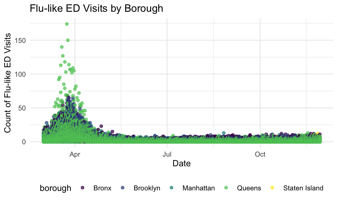
visits_boro_box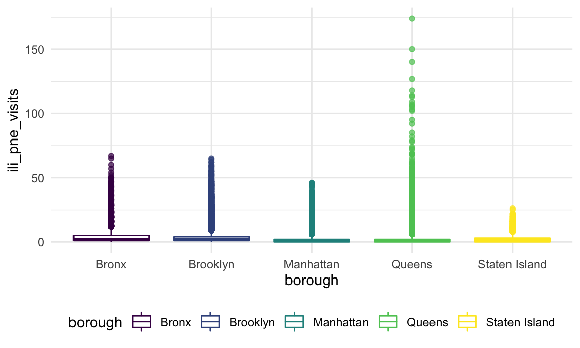
season_box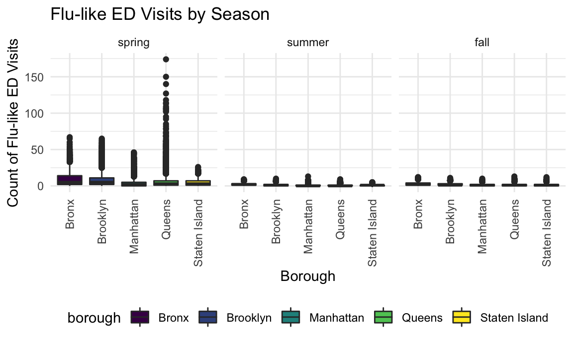
Discussion
As we can see from the above plots, the data is significantly skewed by the COVID-19 pandemic. In the faceted box plot, it is easy to see this stark difference: the spring was when NYC was hardest hit, and that is also when we knew the least about what the disease actually was, so sick people routinely turned up at emergency departments. We can see that Queens was particularly badly hit, which is in line with what we know about the pandemic.
However, looking at the summer and fall give a more normal picture of flu-like illness and pneumonia. We can likely assume that there are some underlying COVID-19 cases presenting at this time, and we also acknowledge that another limitation of this data is that the summer and early fall are not high influenza times. However, we can see an increase again in the fall, and that could be attributed to the flu season picking up.
Our data here is limited, and is descriptive only. But we can postulate that some of the individuals who present with flu-like symptoms at emergency departments across New York, particularly in the fall, are in fact infected with influenza, and thus may have benefited from receiving a flu vaccine. As explored in our vaccination locations page, we can assume that a greater density of locations to obtain a flu shot will result in higher rates of utilization.
As we turn a new corner in the COVID-19 pandemic, many are looking to the possibility of vaccines on the near horizon. However, an important question remains: we have flu vaccines, and utilization sits well below 100%. Will (enough) adults obtain a COVID-19 vaccine to make a difference in the pandemic?